

Reimagining an Iconic Resort for a New Era - Learn more
Sun City, the flagship of Sun International, remains as iconic today as when it first opened in 1979. Nestled between the Elands River and the Pilanesberg Game Reserve, this picturesque resort is home to four hotels, two world-renowned golf courses, and a variety of entertainment, leisure, and cultural experiences.
But with the Sun International’s monolithic brand strategy shift, the resort’s long-standing visual identity, anchored by the coin roundel, needed to evolve.
Brand Repositioning: A World Within a City
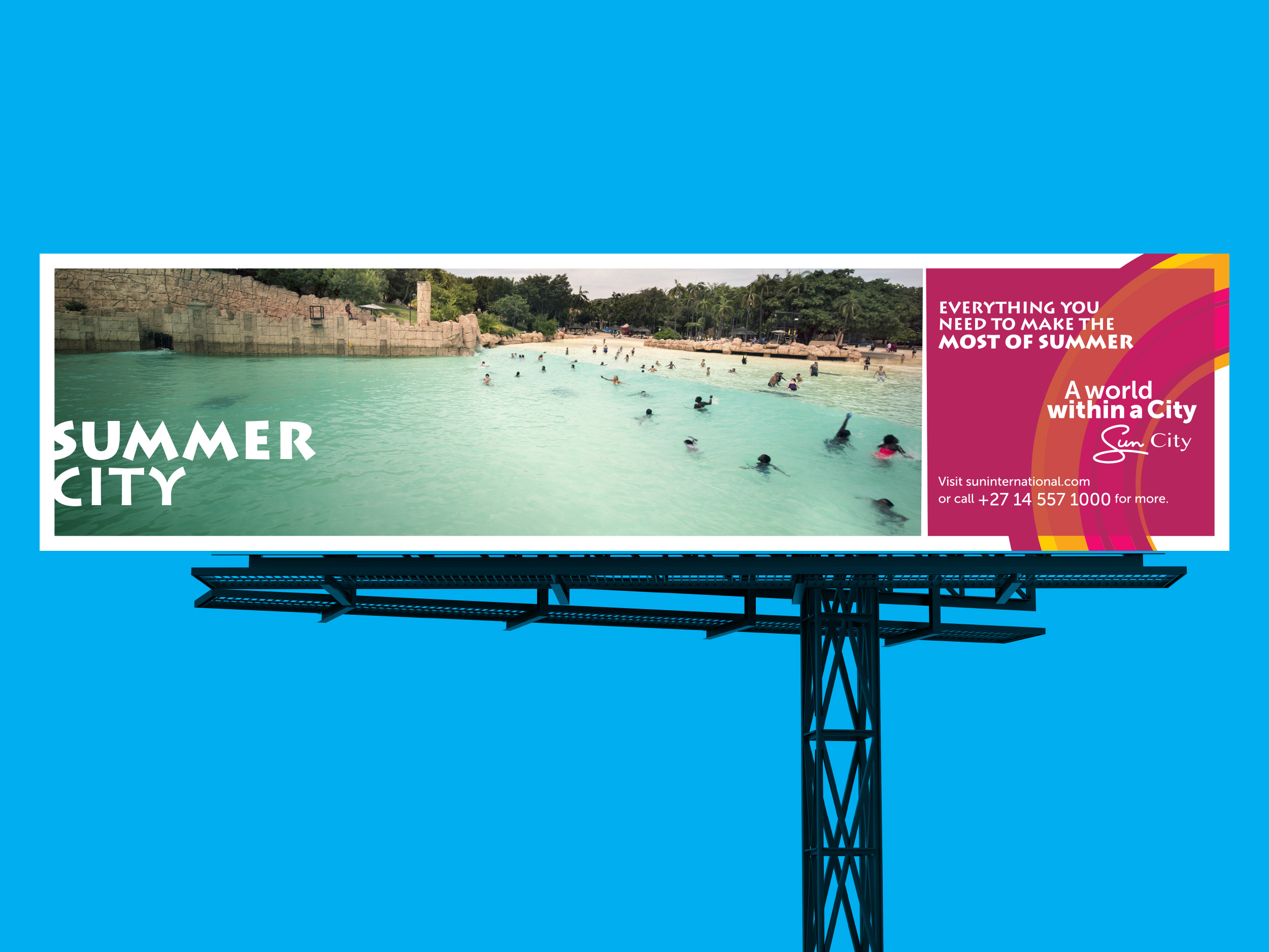
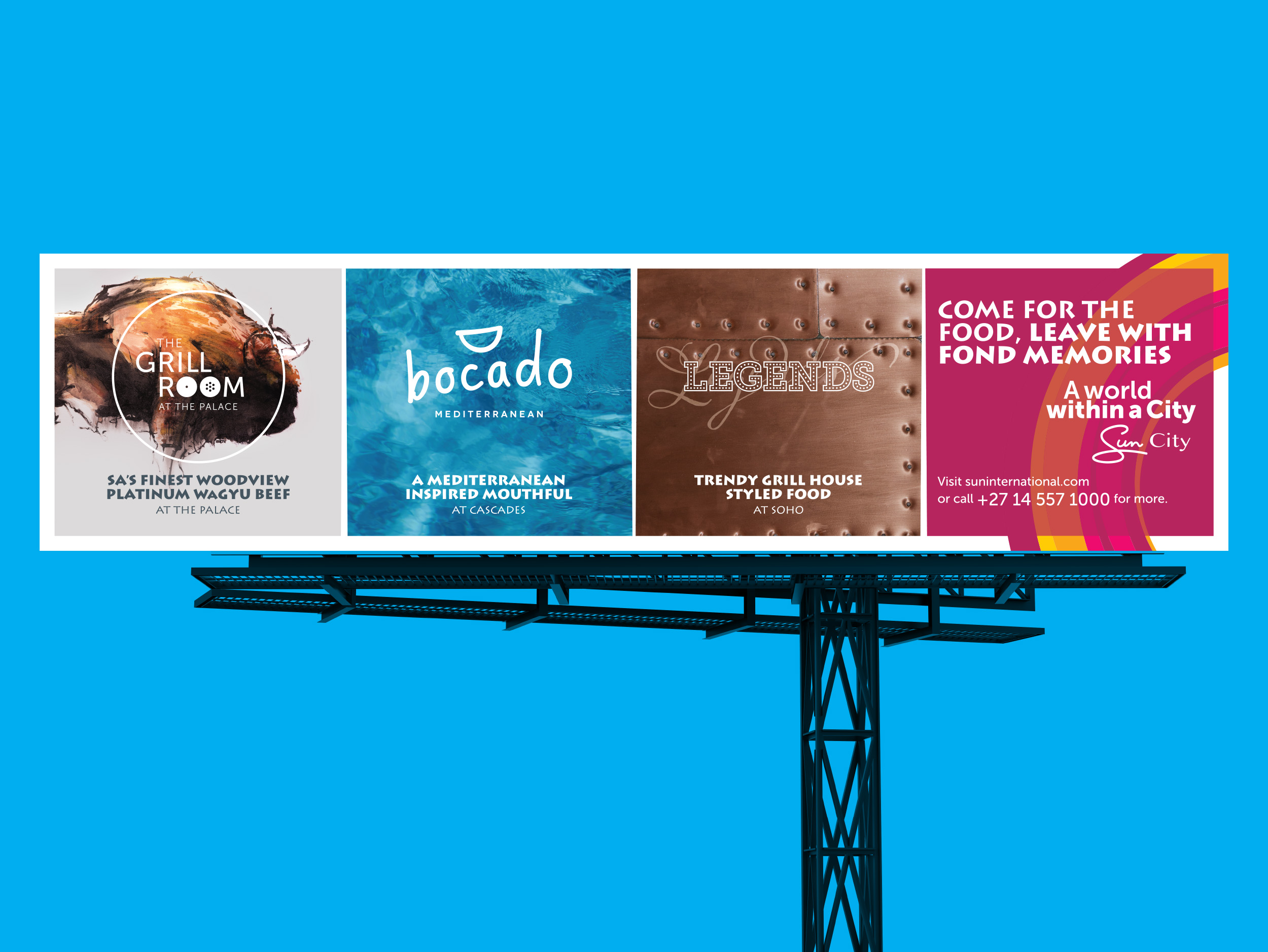
Circle was briefed to create a new positioning and visual language for the resort that better reflected its modern, multifaceted offering. The result: “A World Within a City” This positioning encapsulates the diverse, immersive experiences available to guests, ranging from family fun and adventure to luxury relaxation, all within one expansive destination.
Visual Language & Design System
To bring this positioning to life, Circle developed a bold, flexible visual system inspired by the resort’s natural setting and geographic uniqueness.
Colour Palette
Reflecting the landscape and energy of the region:
- Blue: representing the lake and water-based activities
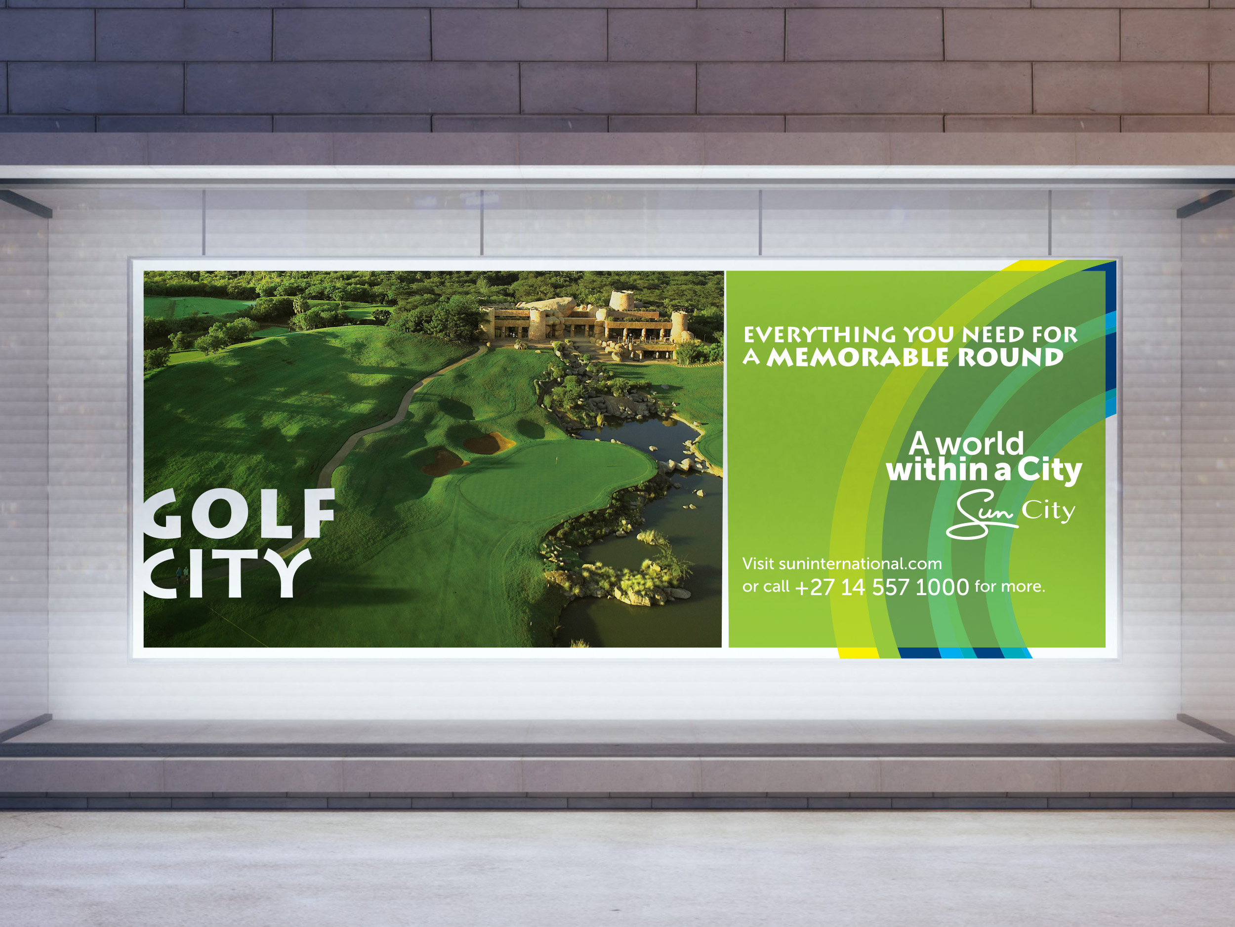
- Green: for lush gardens and golf courses
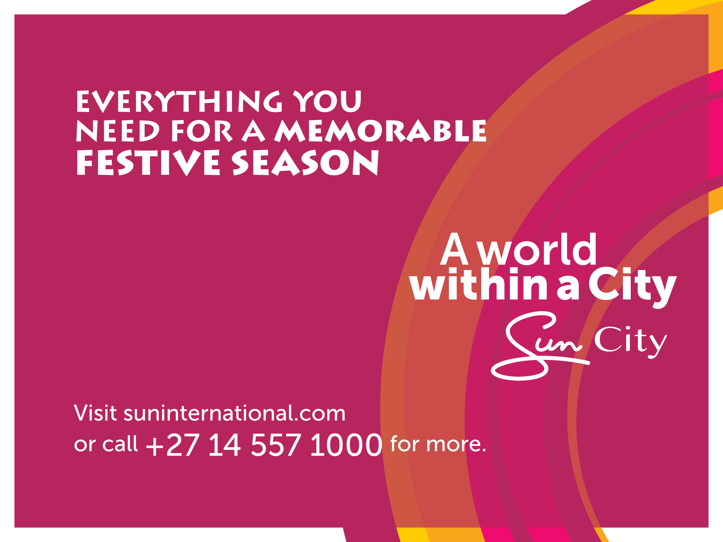
- Red and ochre hues: inspired by the region’s fiery sunsets and volcanic soil
Helios Supagraphic
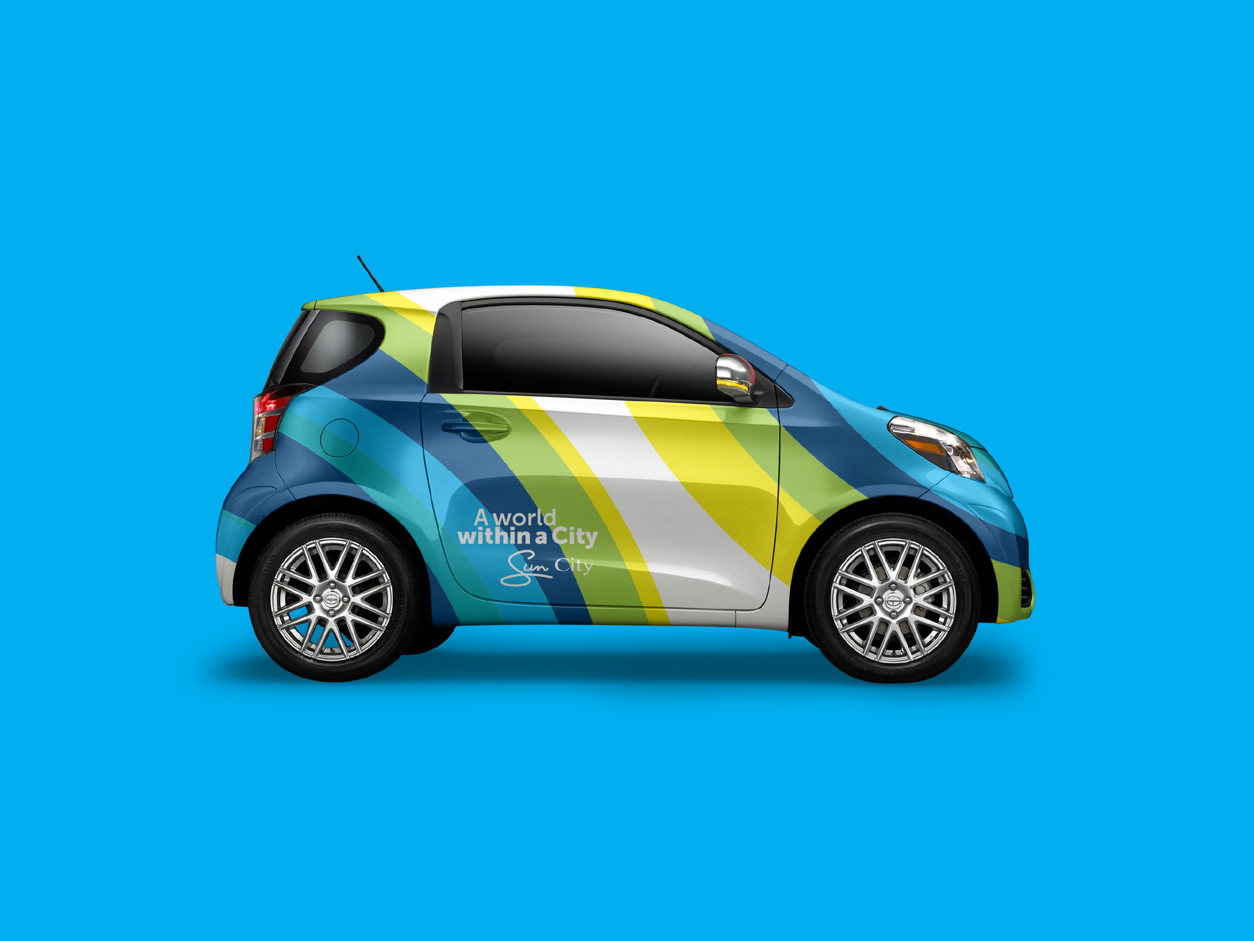
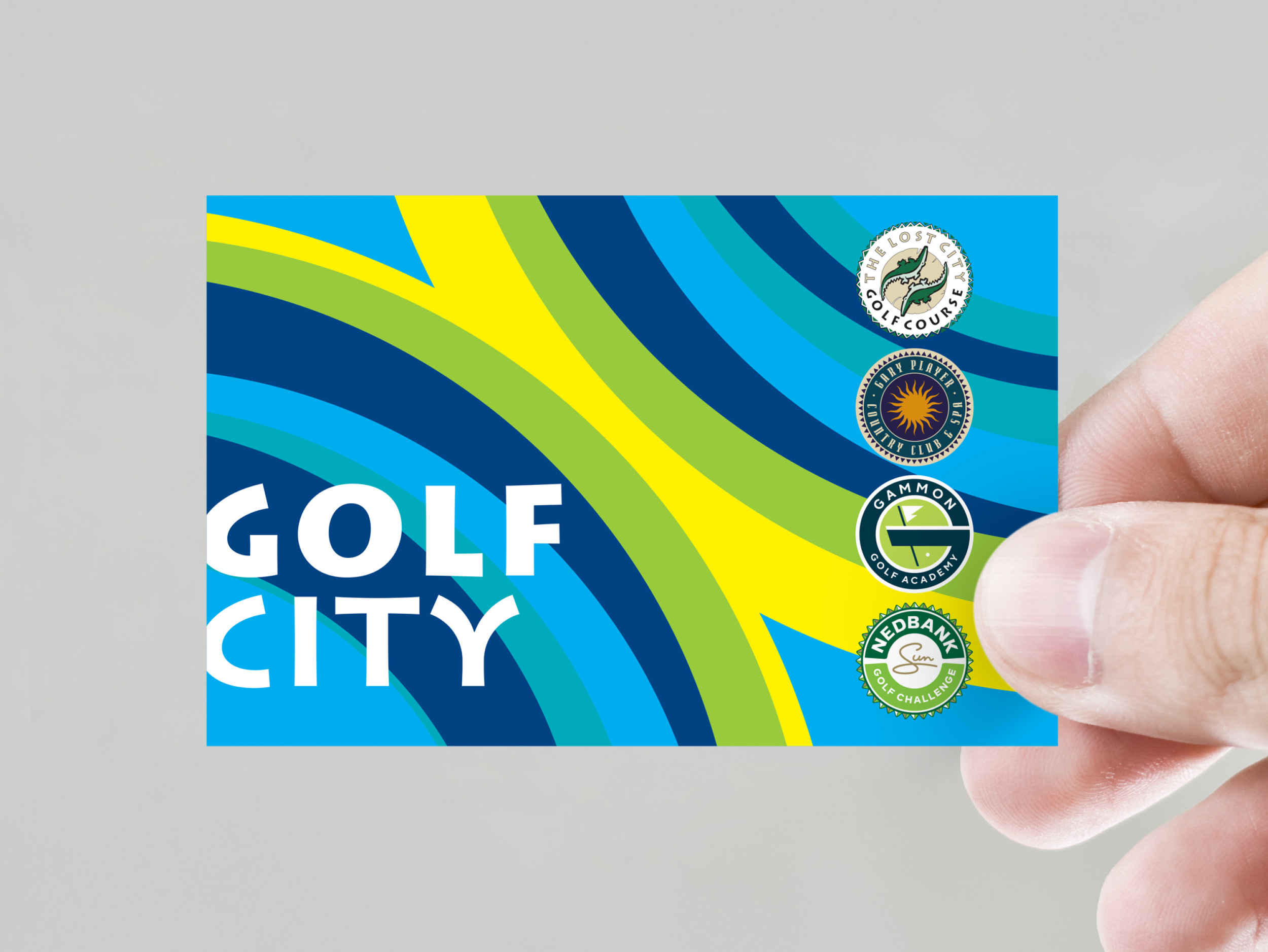
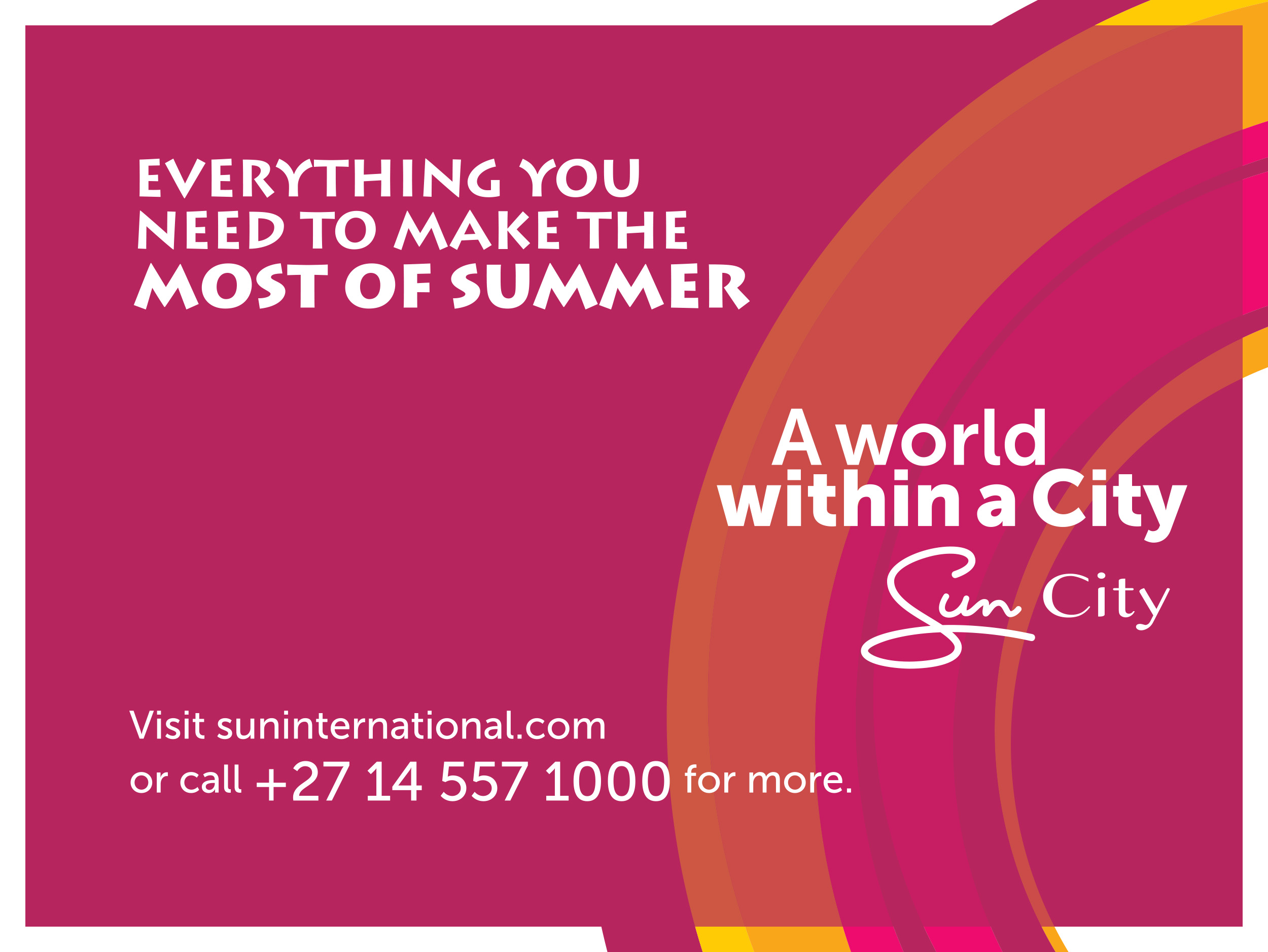
At the heart of the design system is the Helios Supagraphic, a radiating graphic motif inspired by the Pilanesberg’s concentric, volcanic topography.
The Helios serves as a symbol of energy, movement, and unity, perfectly aligned with the resort’s festive and dynamic tone.
Used dynamically across:
- Flag banners
- Uniforms
- Wayfinding
- Collateral for individual hotels
…it creates a cohesive thread that unites all precincts under the broader Sun City identity.
From family-friendly hotels to exclusive luxury suites, from outdoor adventure to evening entertainment, the new visual system is built to scale. It functions across diverse environments while remaining true to the resort’s collective spirit.
This is not just a visual update, it’s a strategic revitalisation of one of South Africa’s most celebrated destinations.






Let’s get in touch
info@circledesign.co.za
+27 (0)83 305 1108
Physical Address
Third Floor, Silky Oak House
Ballyoaks Office Park
35 Ballyclare Drive, Bryanston, 2022
Company Details
Circle Branding by Design Pty (Ltd.)
Company Reg: 2014/208590/07
VAT Reg: 4790267993
B-BBEE
Circle Branding by Design is a Level 2 QSE with 51% black ownership.