

The Best Address in Cape Town - Learn more
A Legacy of Distinction, A View Like No Other
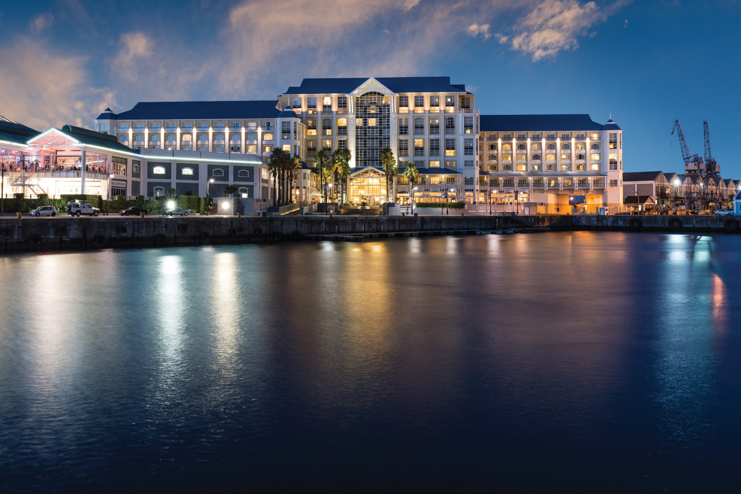
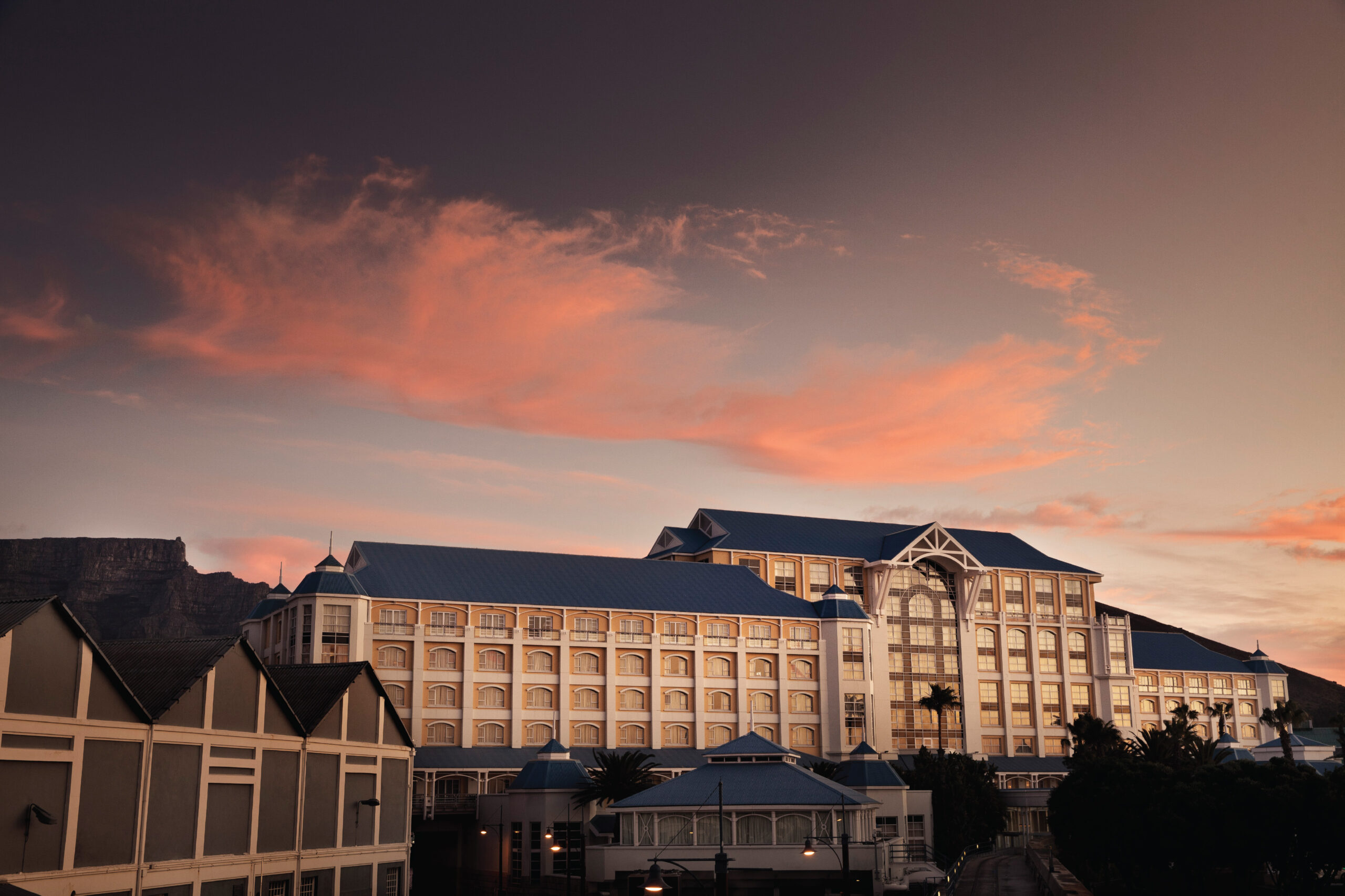
Opened in May 1997 by the revered former president Nelson Mandela, The Table Bay holds a place not only on Cape Town’s iconic Victoria & Alfred Waterfront, but also in the hearts of locals and international travellers alike. Nestled between the Atlantic Ocean and the majesty of Table Mountain, the hotel commands more than just a view, it commands legacy, luxury, and cultural significance.
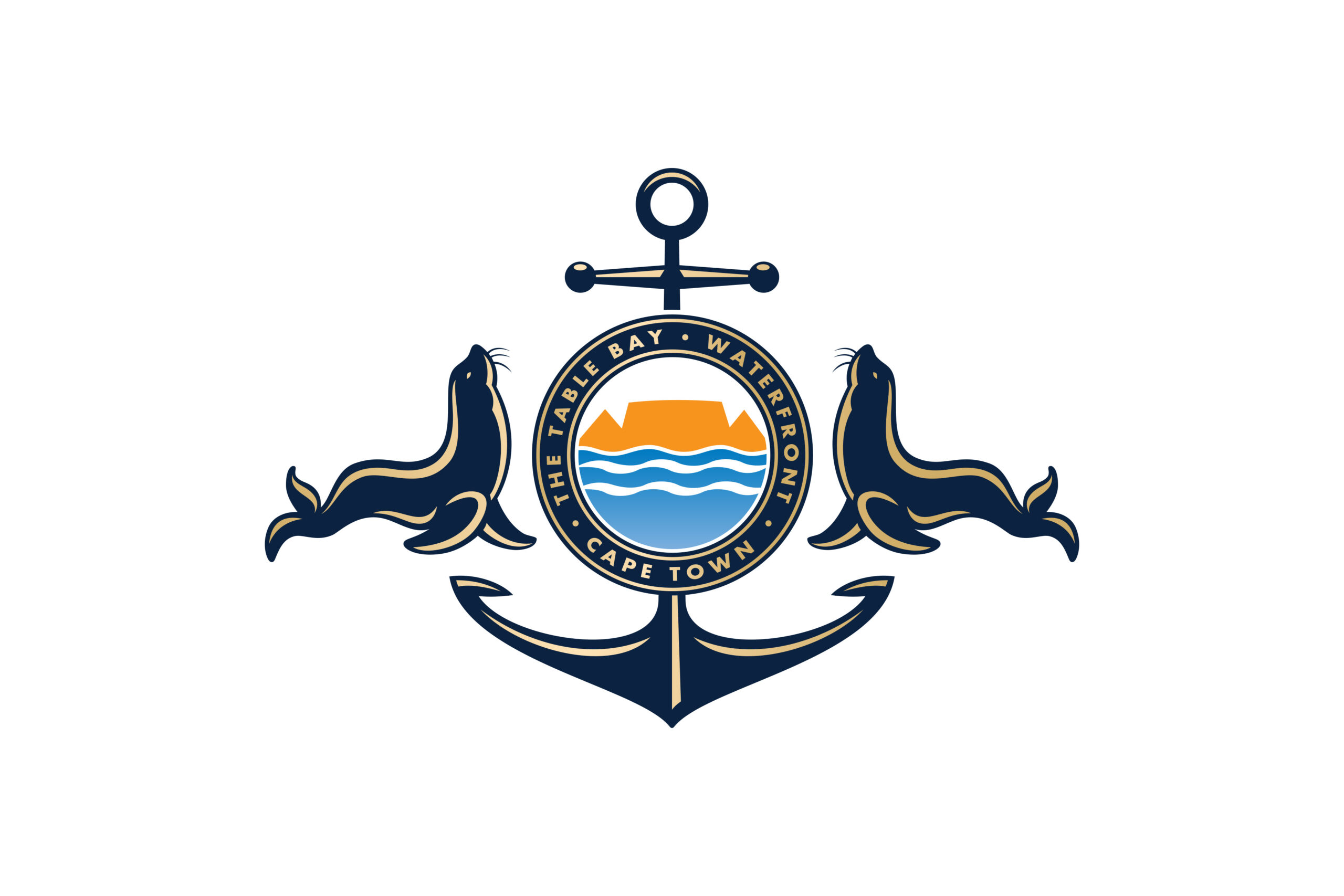
With its location at the epicentre of the Cape’s hospitality industry, The Table Bay operates in one of the most competitive landscapes in the Southern Hemisphere. Circle was tasked with redefining the hotel’s brand identity to assert its positioning as a premium and differentiated offering.
Strategic Positioning: The Best Address in Cape Town
More than a location, The Best Address in Cape Town became a strategic brand truth. One that speaks to geographic precision, emotional resonance, and experiential excellence. This bold positioning celebrates the hotel’s unrivalled views, proximity to Cape Town’s key landmarks, and the stature of those who walk through its doors.
This statement anchors the brand’s communication across platforms, instilling a sense of aspiration and confidence while reaffirming its status as a flagship within the Sun International portfolio.
Visual Language: Inspired by Interior Grandeur
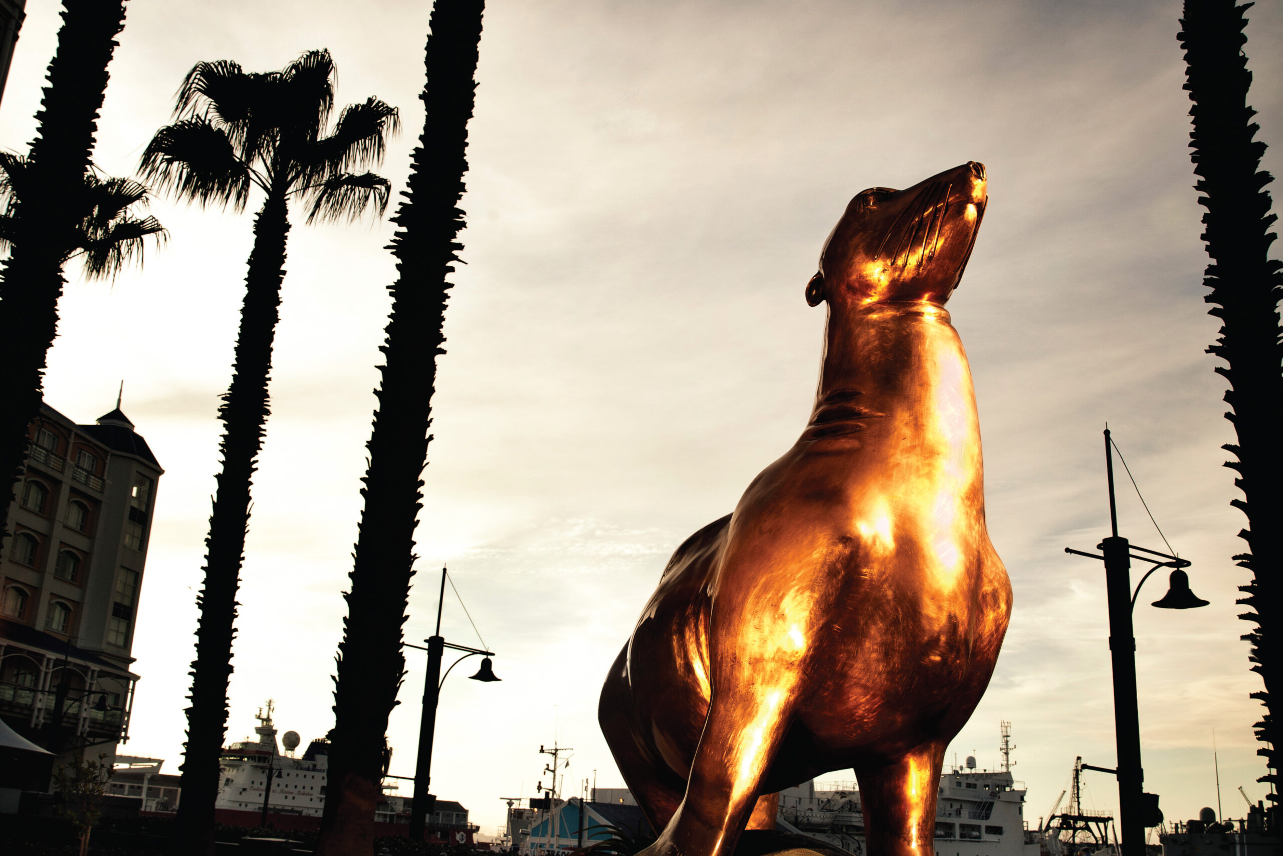
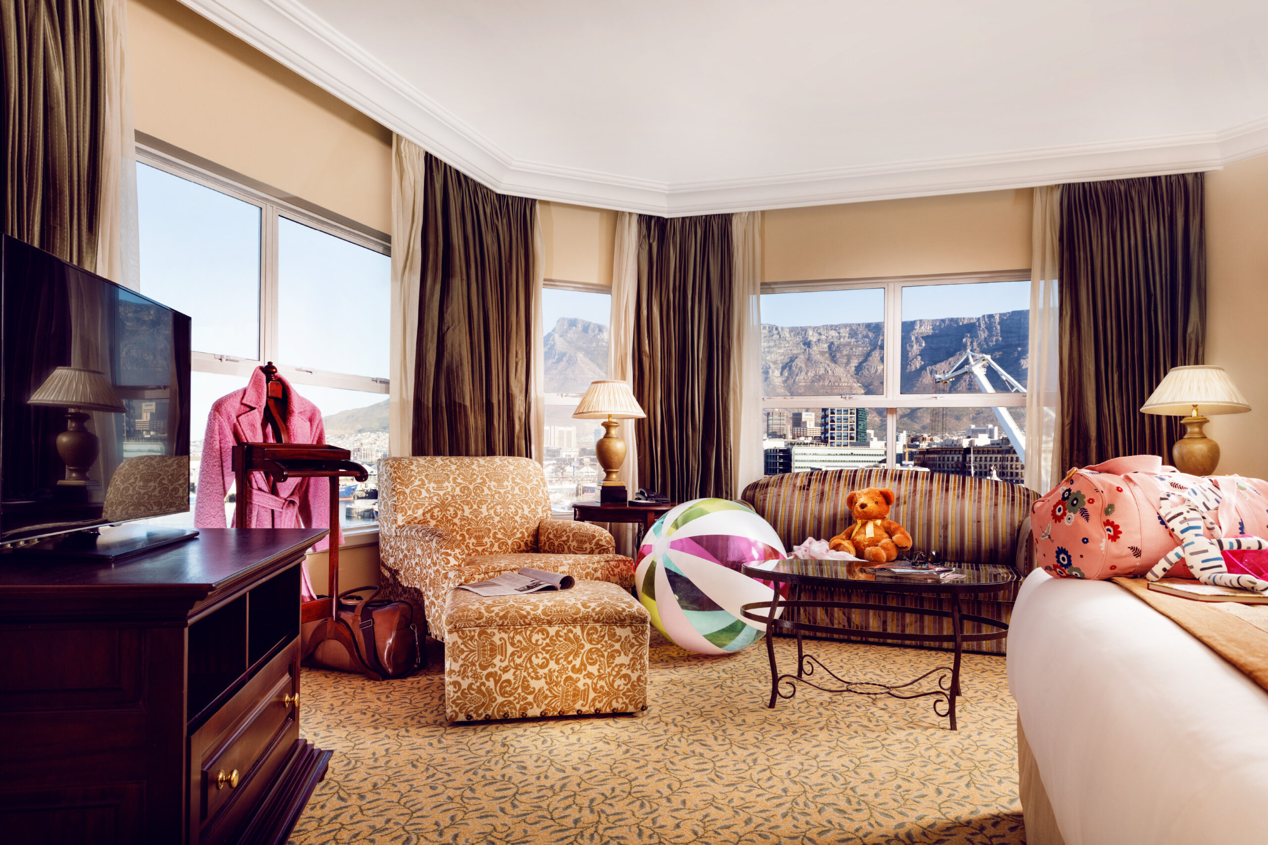
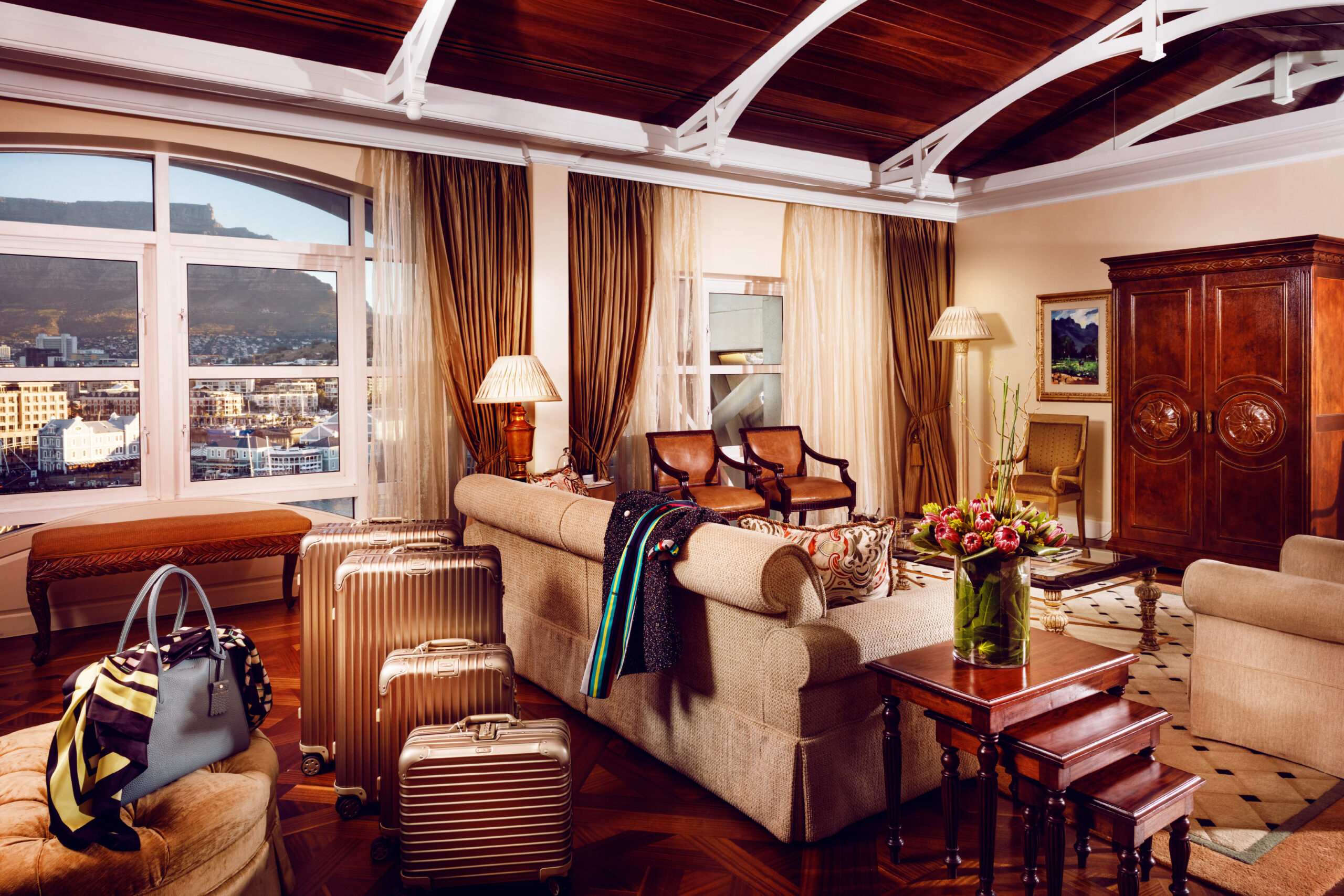
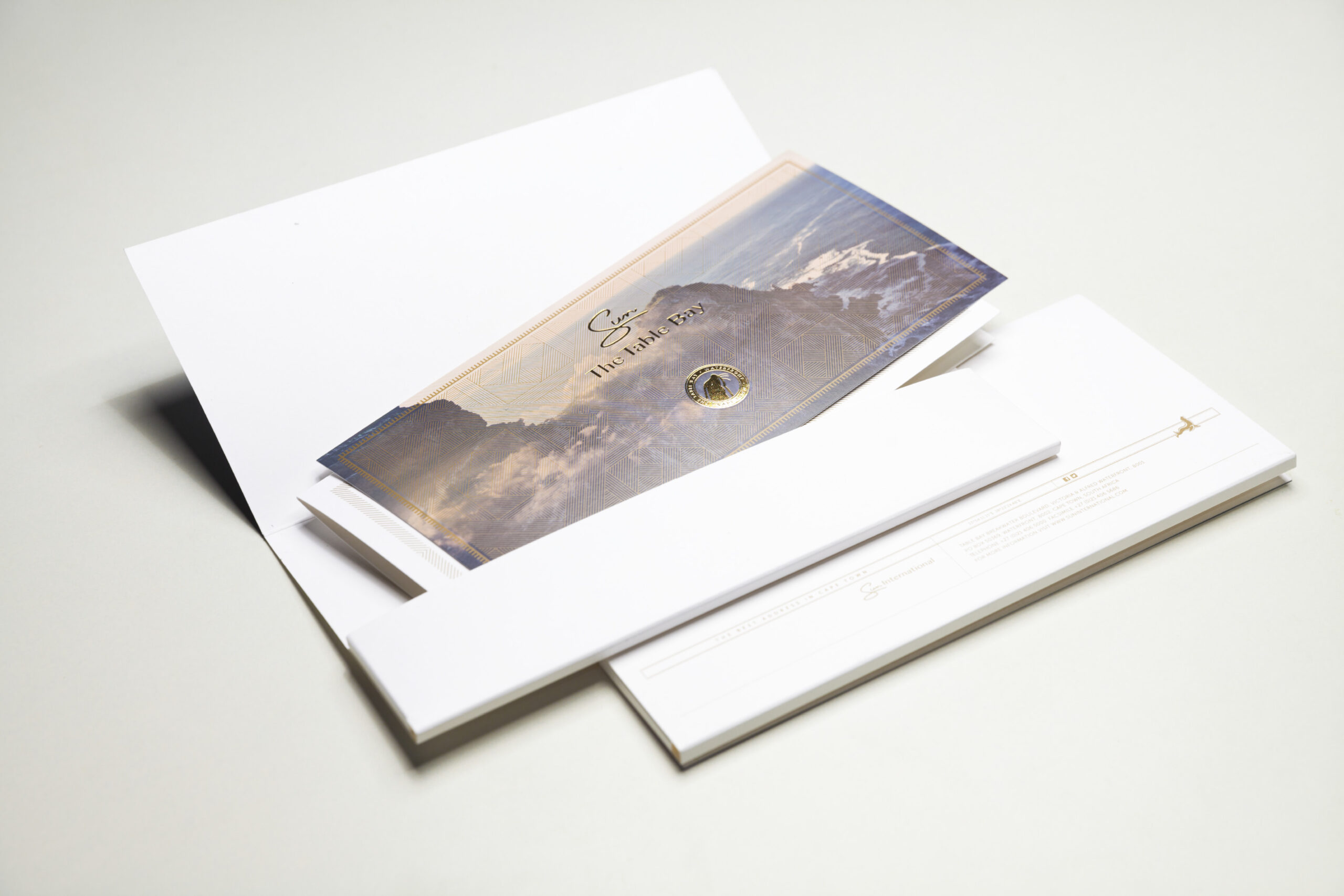
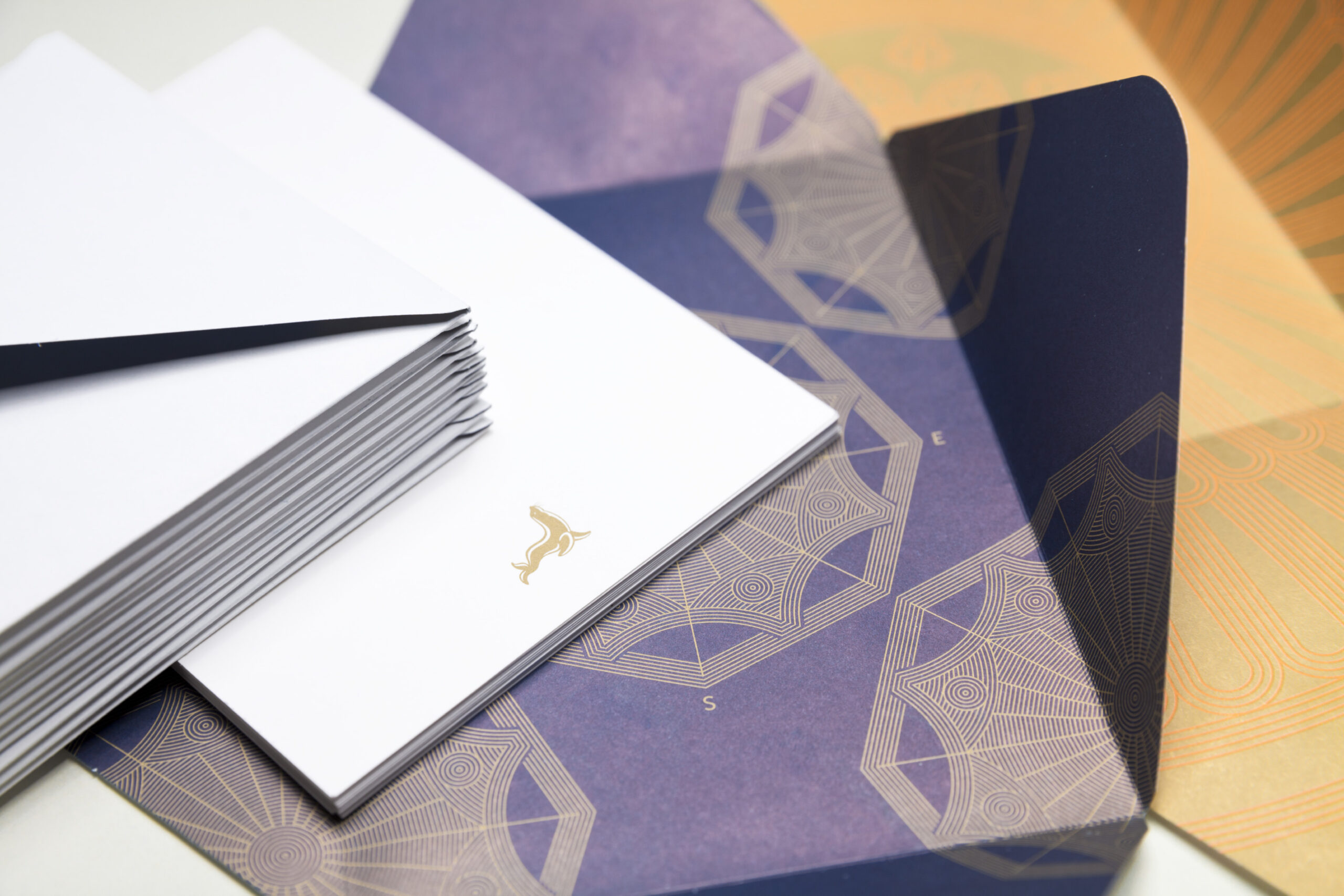
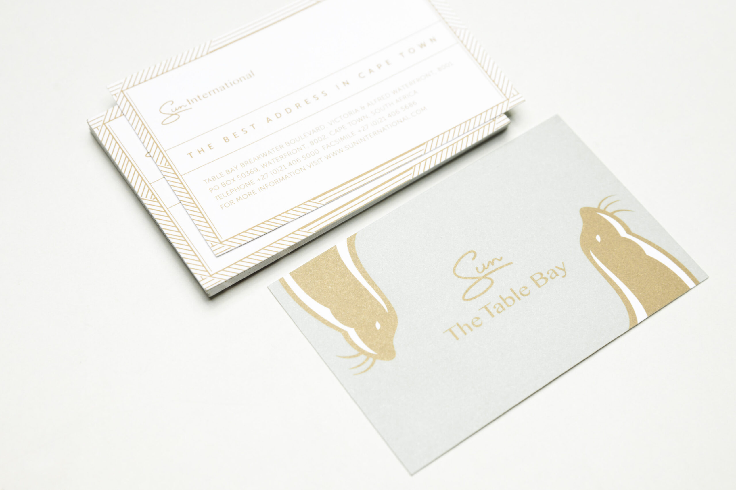
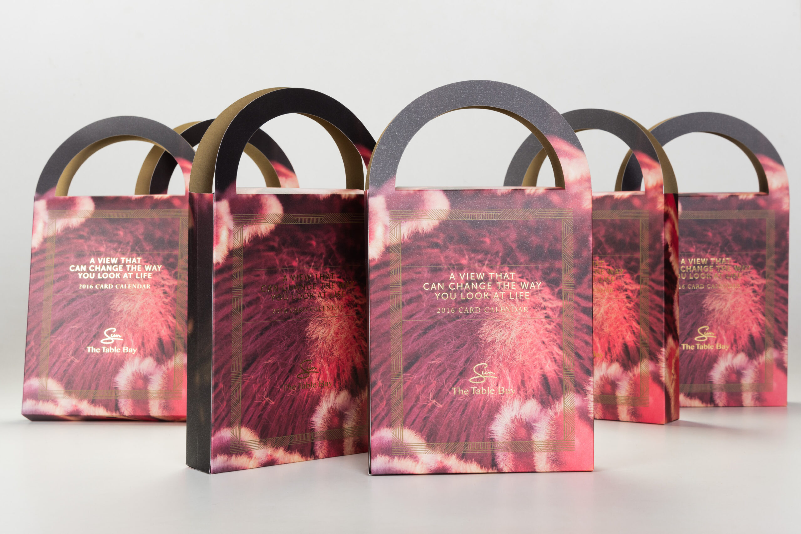
Drawing from the hotel’s lavish interiors, rich textures, classical architecture, and contemporary sophistication, Circle designed a visual language that could capture the opulence of The Table Bay without overwhelming it. Each design touchpoint balances heritage with modernity, echoing the refined details that guests encounter throughout the property.
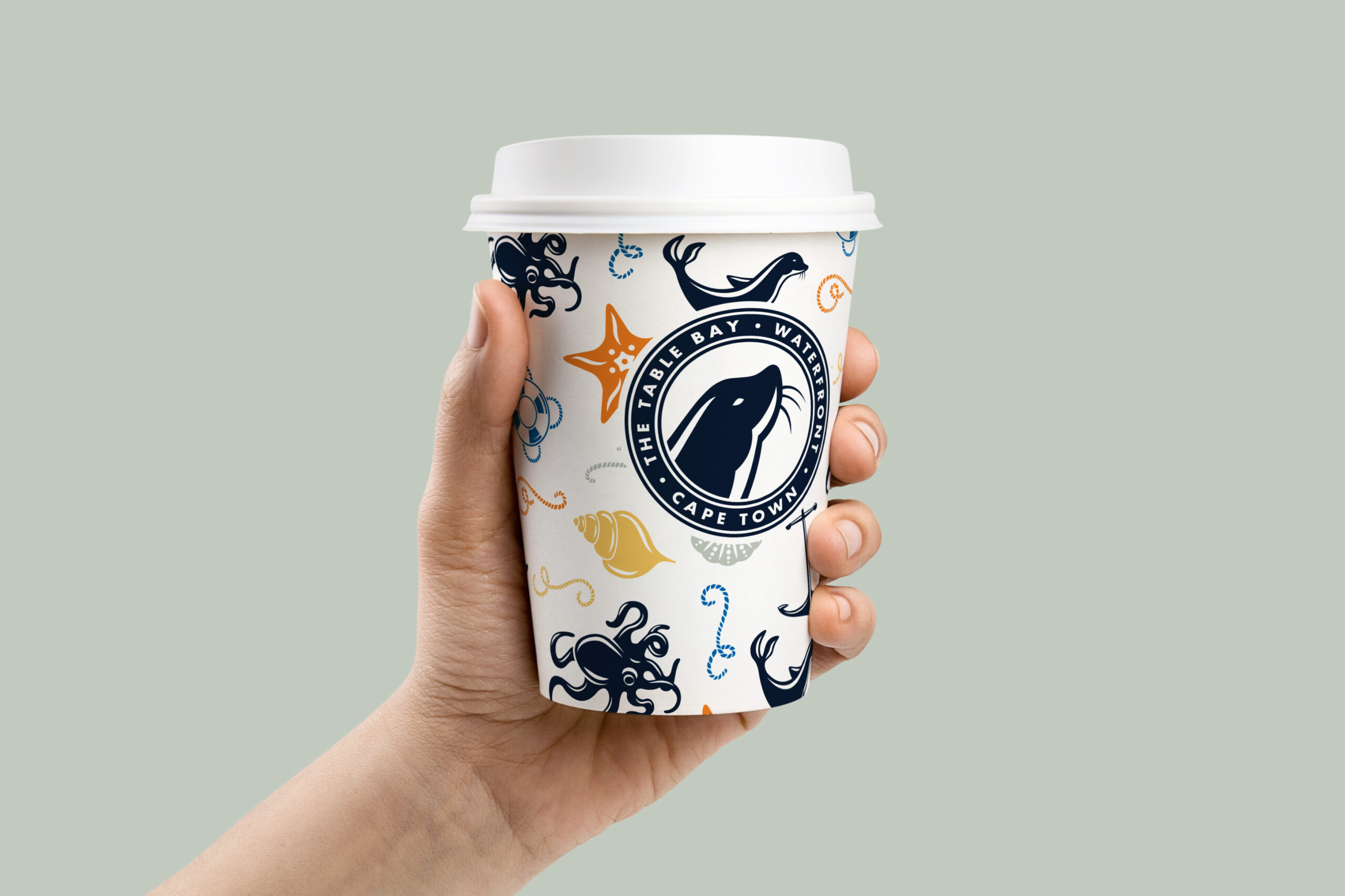
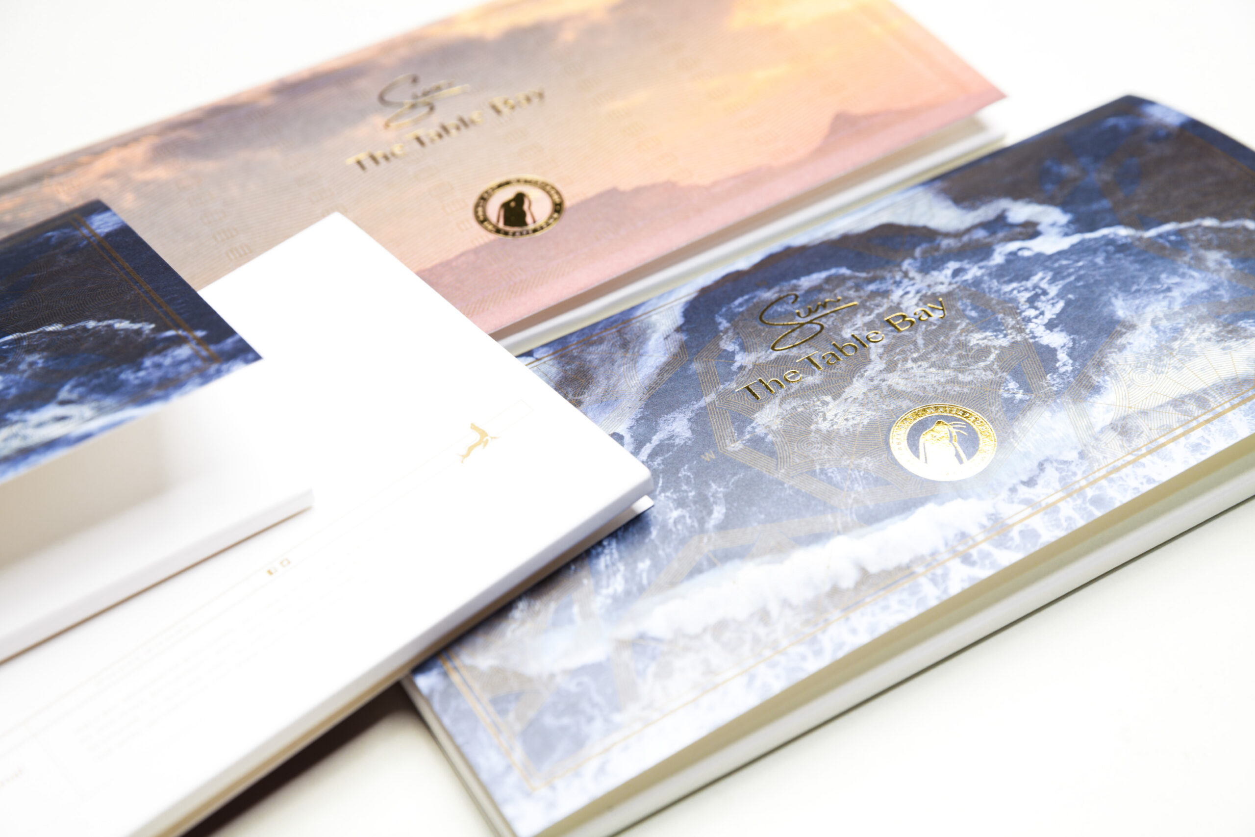
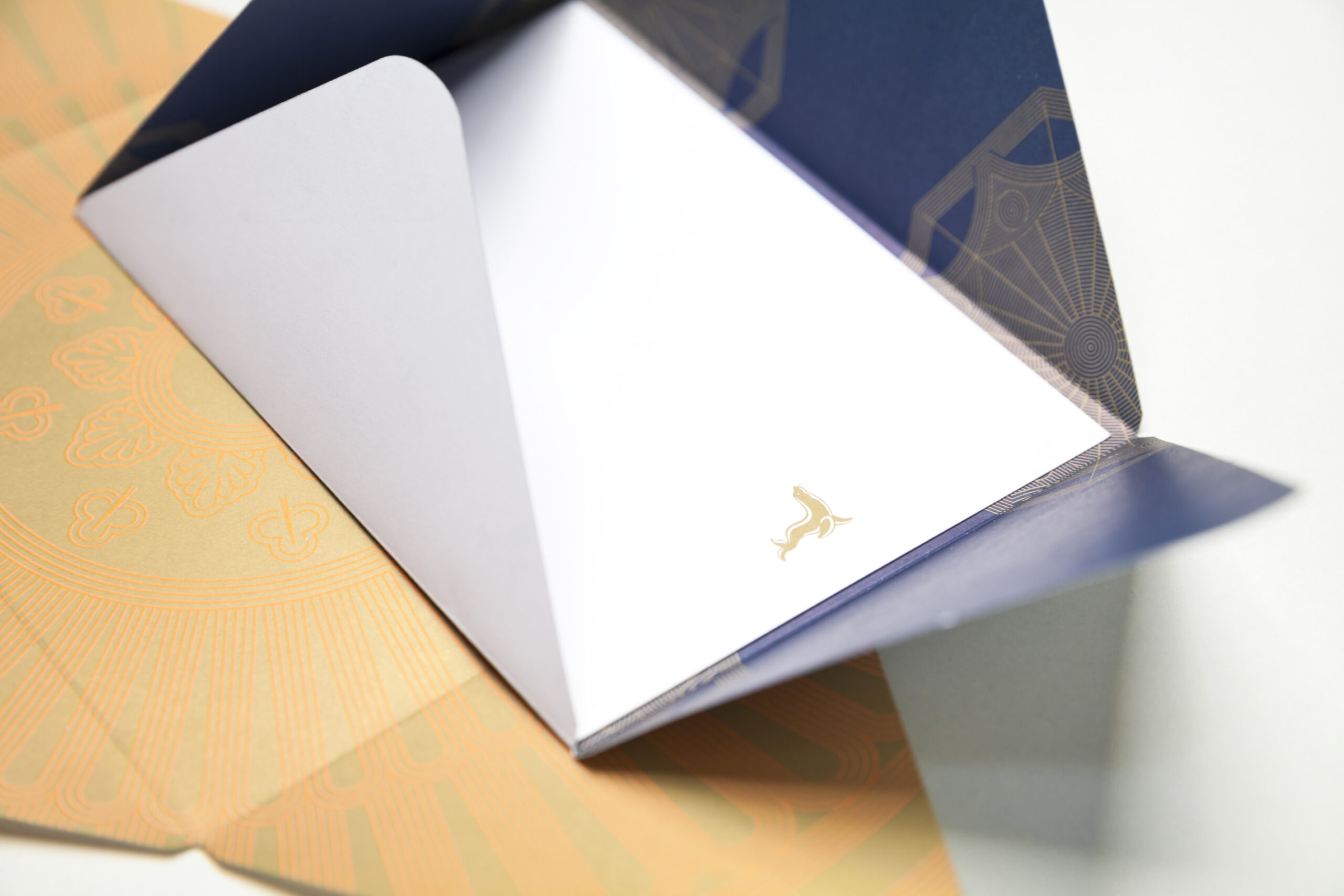
A palette inspired by the coastal and mountainous environment complements an identity that is both timeless and cosmopolitan. The visual system is elegant yet bold, allowing the brand to flex confidently across traditional and digital channels.
Brand Expression: Across Every Touchpoint
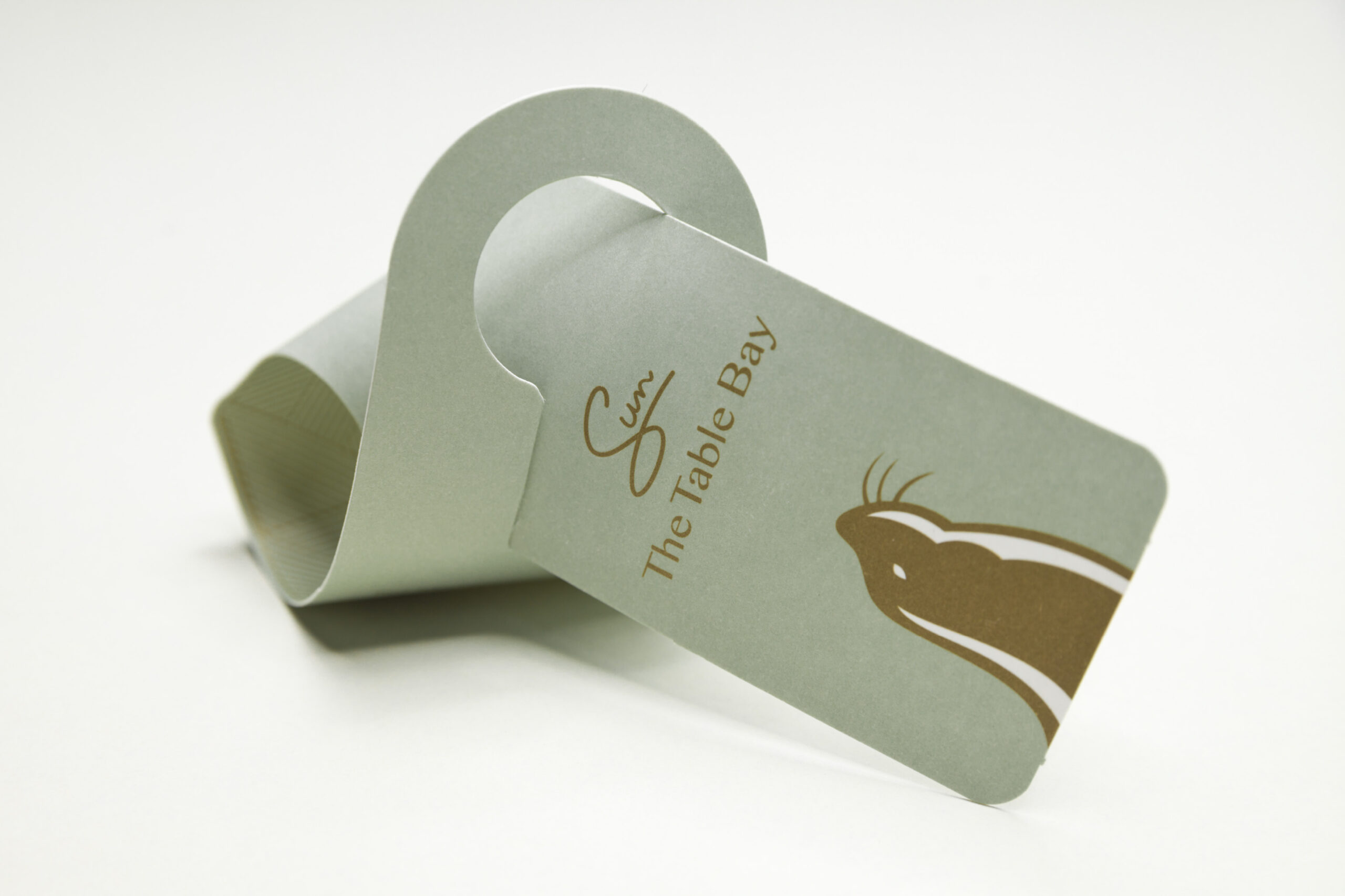
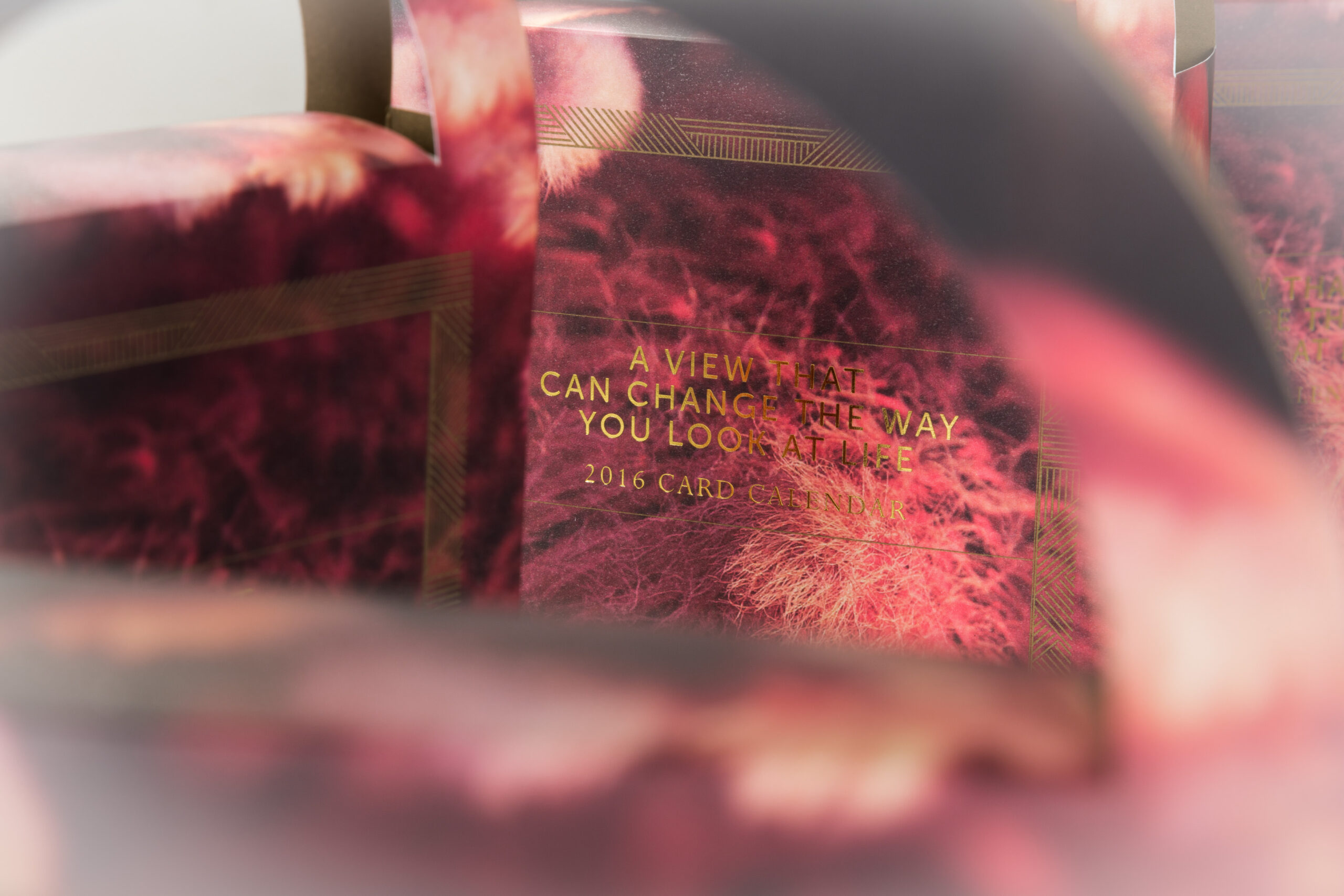
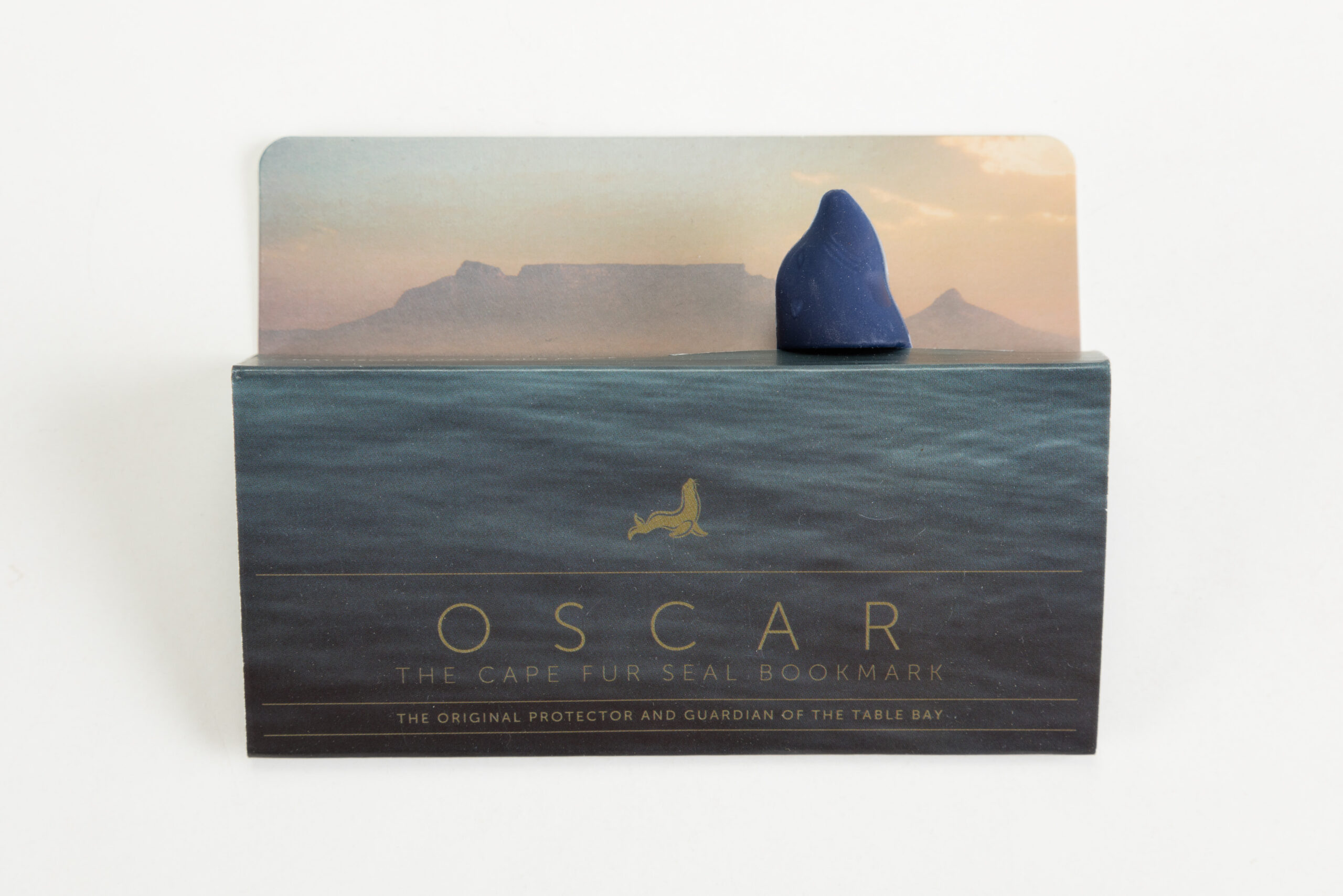
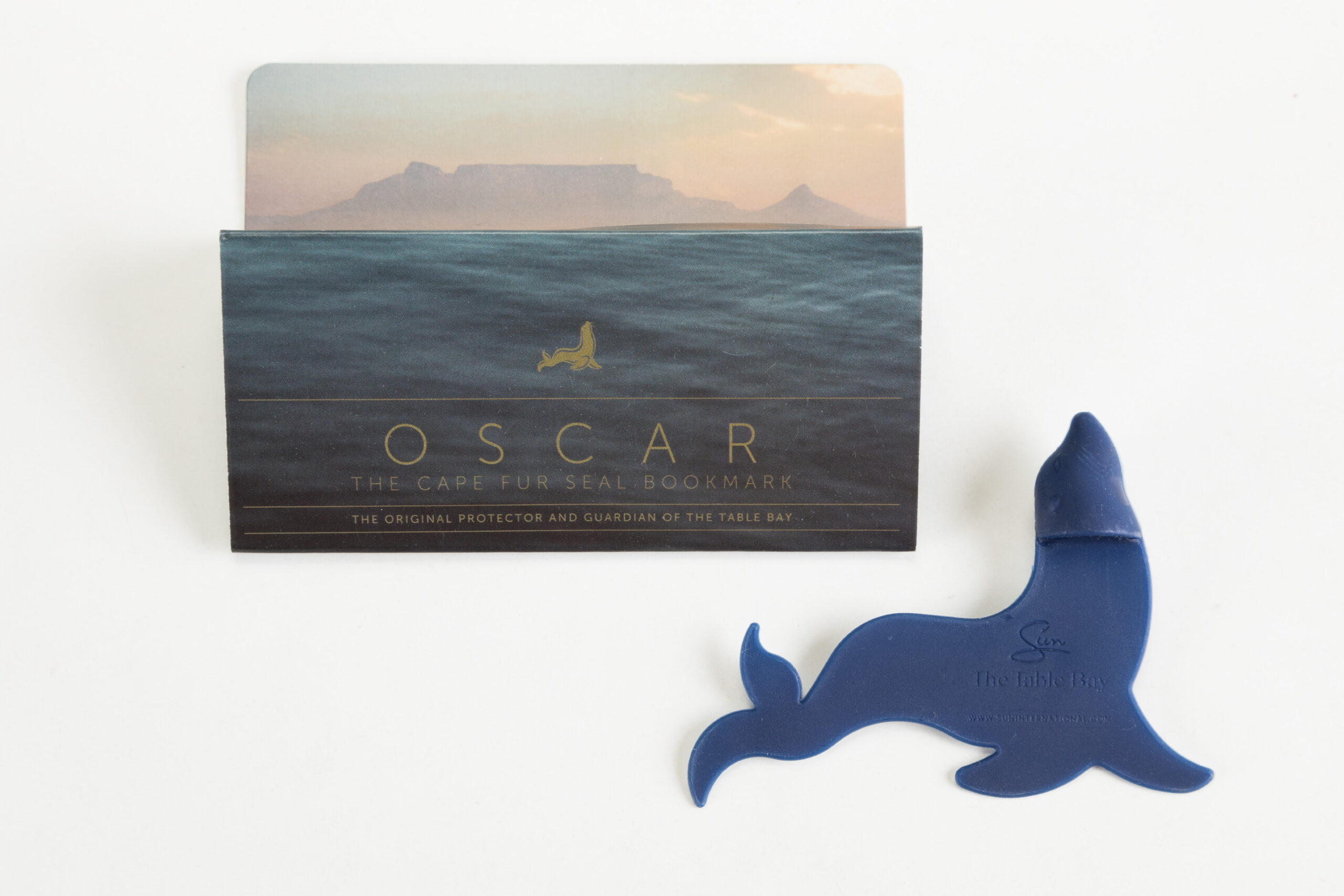
The refined brand language was extended across a suite of applications, from photography art direction and in-room amenities to curated guest gifting, business stationery, and digital platforms. Every expression of the brand was meticulously crafted to evoke a sense of warm grandeur and bespoke hospitality.
Whether experienced through the folds of a gift ribbon, the cadence of the tone of voice, or the lens of a guestroom window, The Table Bay identity always leads with a quiet, confident luxury.
Enduring Prestige, Contemporary Appeal
The new identity affirms The Table Bay’s place not only as a hotel but as a symbol of history, of luxury, of Cape Town itself. It is a brand that honours its past while being distinctly attuned to the needs of today’s modern, discerning traveller.
At The Table Bay, the view is iconic but the experience is unforgettable.













Let’s get in touch
info@circledesign.co.za
+27 (0)83 305 1108
Physical Address
Third Floor, Silky Oak House
Ballyoaks Office Park
35 Ballyclare Drive, Bryanston, 2022
Company Details
Circle Branding by Design Pty (Ltd.)
Company Reg: 2014/208590/07
VAT Reg: 4790267993
B-BBEE
Circle Branding by Design is a Level 2 QSE with 51% black ownership.